There are 6,414 live Shopify stores in Lebanon as of 30 October 2026. Two thirds of them sell in three categories: 2,043 in apparel, 1,293 in beauty and fitness, 887 in home and garden. [1] That is 4,223 stores competing in the same three aisles, and most of them opened in the last three years.
So when a new Lebanese skincare brand launches with a beige box, a thin serif wordmark and a sage-green Instagram grid, it is not entering an empty room. Its category already has 1,293 stores, and it is asking to be remembered among them.
Why it happens
Nobody sets out to look like everyone else. It happens for four ordinary reasons, and I see all four in the first week of every cohort I teach.
The template came first. The brand was designed in a tool that offers the same twenty starting points to everyone in Lebanon, and the same twenty to everyone in Dubai, Cairo and Lisbon. Templates are not bad. Starting from one is. By the time you have changed the colour and the name, you have made the same decisions as a thousand other founders who started from the same file.
The palette came from Pinterest. Beige, sage, terracotta, off-white. These colours read as premium because the brands that made them famous were premium. Copied, they read as "I looked at the same board you did." A palette is a position, and a borrowed palette is a borrowed position.
The Arabic came last. The Latin wordmark was designed, approved and printed. Then someone was asked for an Arabic version, usually at the end, usually on a smaller budget, and it was squeezed into the same box. In a market where most customers read Arabic first, the weaker half of the brand is the half most people see. I have written about this one separately, because it is the most expensive mistake on the list.
The logo was chosen before the position was. The founder had three logo options and a group chat. Nobody had a sentence that said who this brand is for and what it refuses to be. Without that sentence, the only way to judge a logo is whether people in the chat like it, and people in the chat like what they have seen before.
The five decisions, in order
These are the five decisions I make students take before they are allowed to open a design tool. The order matters more than any single answer.
1. Who is it not for
Everyone can tell you who their brand is for. Almost nobody can tell you who it is not for, and that is the sentence that makes a brand recognisable. "Skincare for Lebanese women" is a category. "Skincare for women who are tired of being sold a routine" is a position, and it rules out half the market on purpose. Write the sentence. If it does not exclude anyone, it is not a position yet.
2. A name you can own in both scripts
Before you fall in love with a name, check three things. Can it be registered as a trademark in Lebanon and in the Gulf markets you will sell to? Does it sound the same when a Beiruti and a Saudi say it? Does it mean anything unfortunate in a dialect you do not speak? A name that fails any of these will cost you a rebrand later, and rebrands cost more than brands.
3. One colour that is yours
Not a palette. One colour, chosen because nobody in your category in Lebanon is using it, and then used relentlessly. Look at what your fifty nearest competitors use, write it down, and pick from what is left. If that leaves you with a colour you find slightly uncomfortable, good. Comfortable is what everyone else chose. Build the rest of the palette around that one decision, and check the contrast so it survives on a phone screen in daylight.
4. A type pair designed together
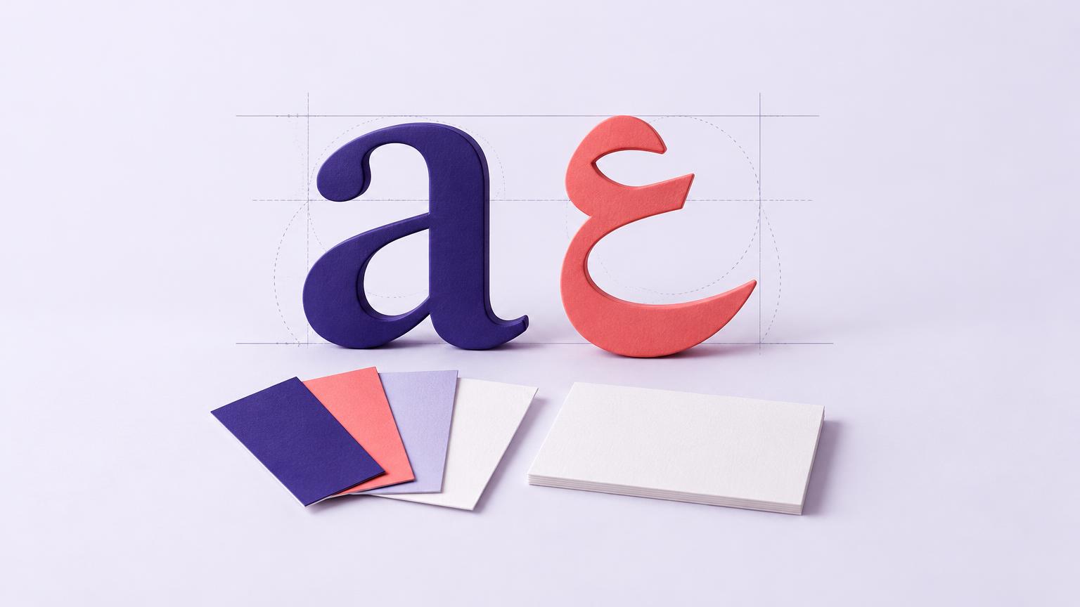
Pick the Arabic typeface and the Latin typeface in the same sitting, by the same person, against the same brief. Set the same sentence in both and look at them side by side. If one looks like it belongs to a different brand, it does. Arabic has taller ascenders and deeper descenders than Latin, so the spacing has to be set separately even when the point size matches. Get this right once and every post, label and invoice you make for the next five years will look like it came from one place.
5. One rule you never break
Consistency is what turns a design into a brand. Pick one rule and keep it for a year: the logo always sits bottom left, or every photo is shot on the same grey, or the product is always shown in a hand, never on a surface. Customers do not notice rules. They notice when a brand feels like itself every time, and they cannot say why. The rule is the why.
What this costs, and what it does not
None of the five decisions costs money. They cost a week of thinking before the design starts, and they save the rebrand most Lebanese brands go through in year two when the founder realises the beige box is invisible on a shelf of beige boxes.
The logo, the packaging, the grid and the photography all come after, and they come faster, because every choice now has something to be judged against other than taste.
Try it this week
Screenshot the Instagram grids of your ten nearest competitors, cover the names, and see if you can tell them apart. Then do it with yours.
Write the "who it is not for" sentence. One line. Show it to someone who will be honest.
List every colour your competitors use. Pick from what is left.
Set the same sentence in your Arabic and Latin type, side by side, on a phone.
Choose one rule you will not break for twelve months, and write it down where the person posting can see it.
If you want to do all five on your own brand with someone pushing back on each answer, that is what the Branding & Design course is built for. We start with the sentence, not the logo.
Frequently asked questions
Because those colours became shorthand for premium through a handful of international brands, and they are the default on the mood boards and templates most founders start from. Copied in a market where two thirds of online stores sell apparel, beauty or homeware, they stop signalling premium and start signalling sameness.
Both, at the same time, by the same person. Designing the Latin first and adding Arabic later produces a brand that reads as foreign in the script most of your customers read first. The two scripts should be set side by side from the first draft.
You need one sentence: who the brand is for and, more importantly, who it is not for. Without it there is no way to judge a logo except whether people like it, and people like what is familiar, which is how everyone ends up looking the same.
The five decisions in this article cost nothing but a week of honest thinking. The design work that follows varies widely with scope. What is reliably expensive is the rebrand a year later when a brand built on a template discovers it is invisible next to its competitors.
References
[1]Store Leads. Shopify Stores in Lebanon, dated 30 October 2026 For the 6,414 live stores and the apparel, beauty and fitness, and home and garden counts. Store Leads counts detectable storefronts, not confirmed trading businesses.